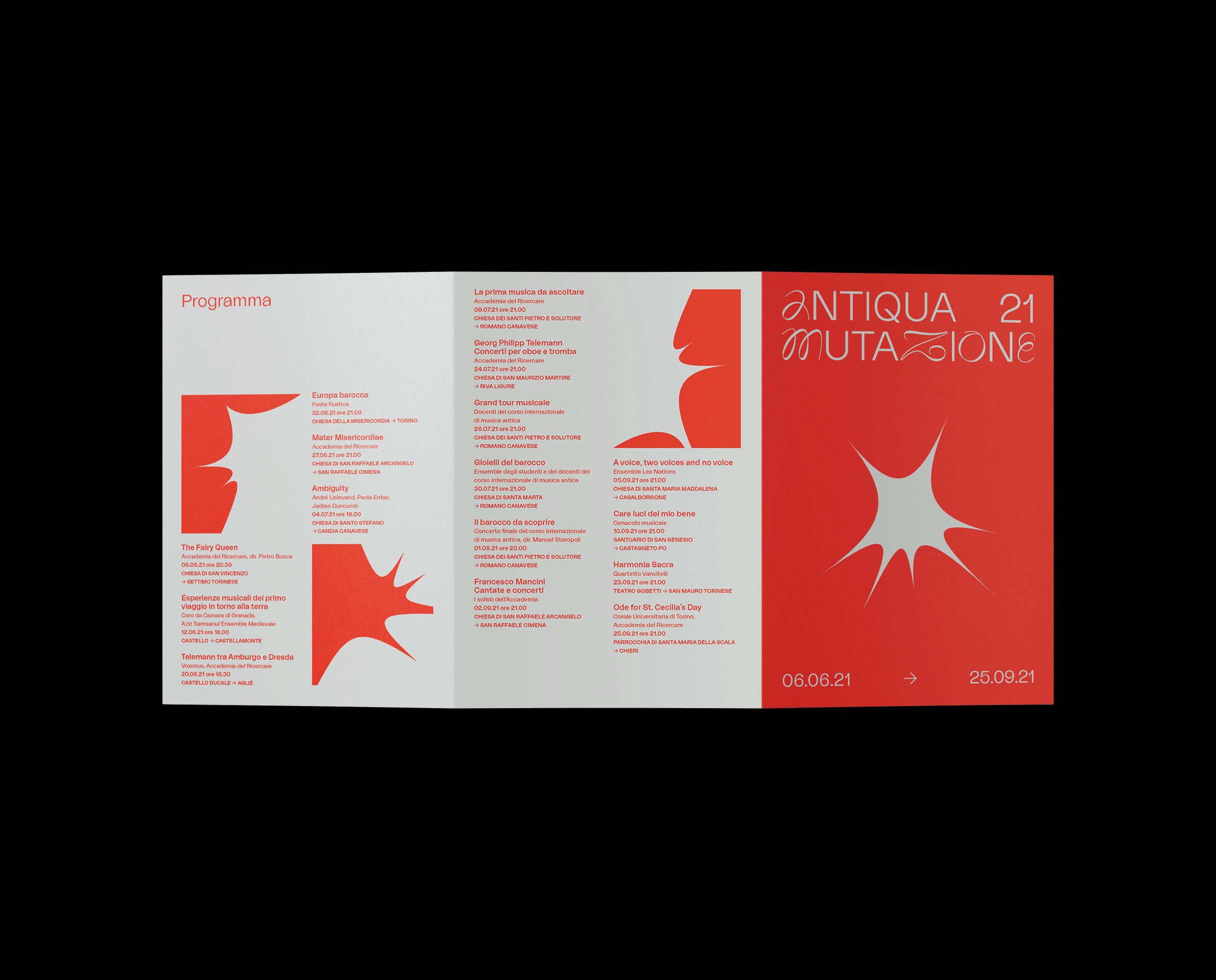
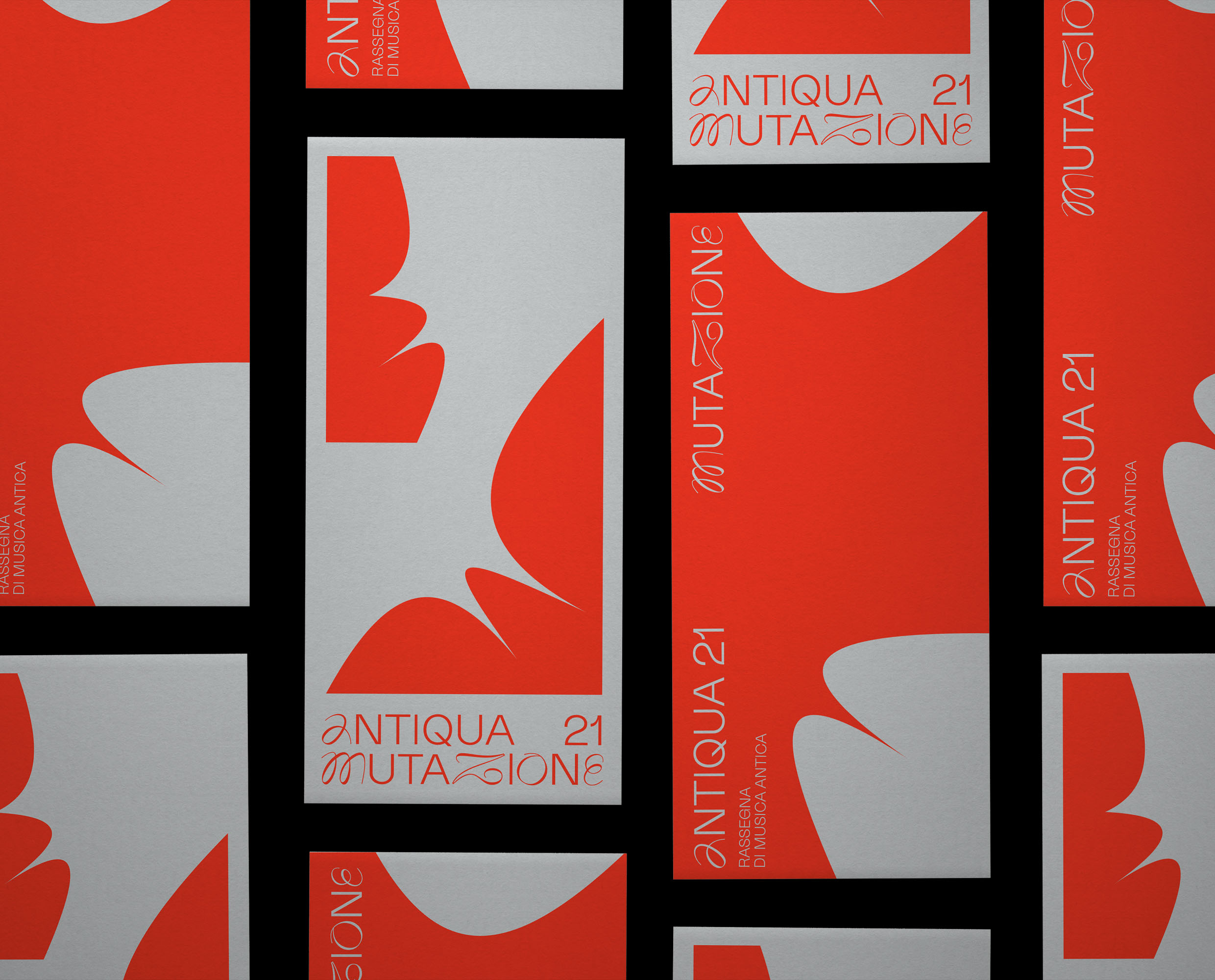
The Rose is the basic form, the nerve center of identity. It comes to life through the alteration of its anchor points.
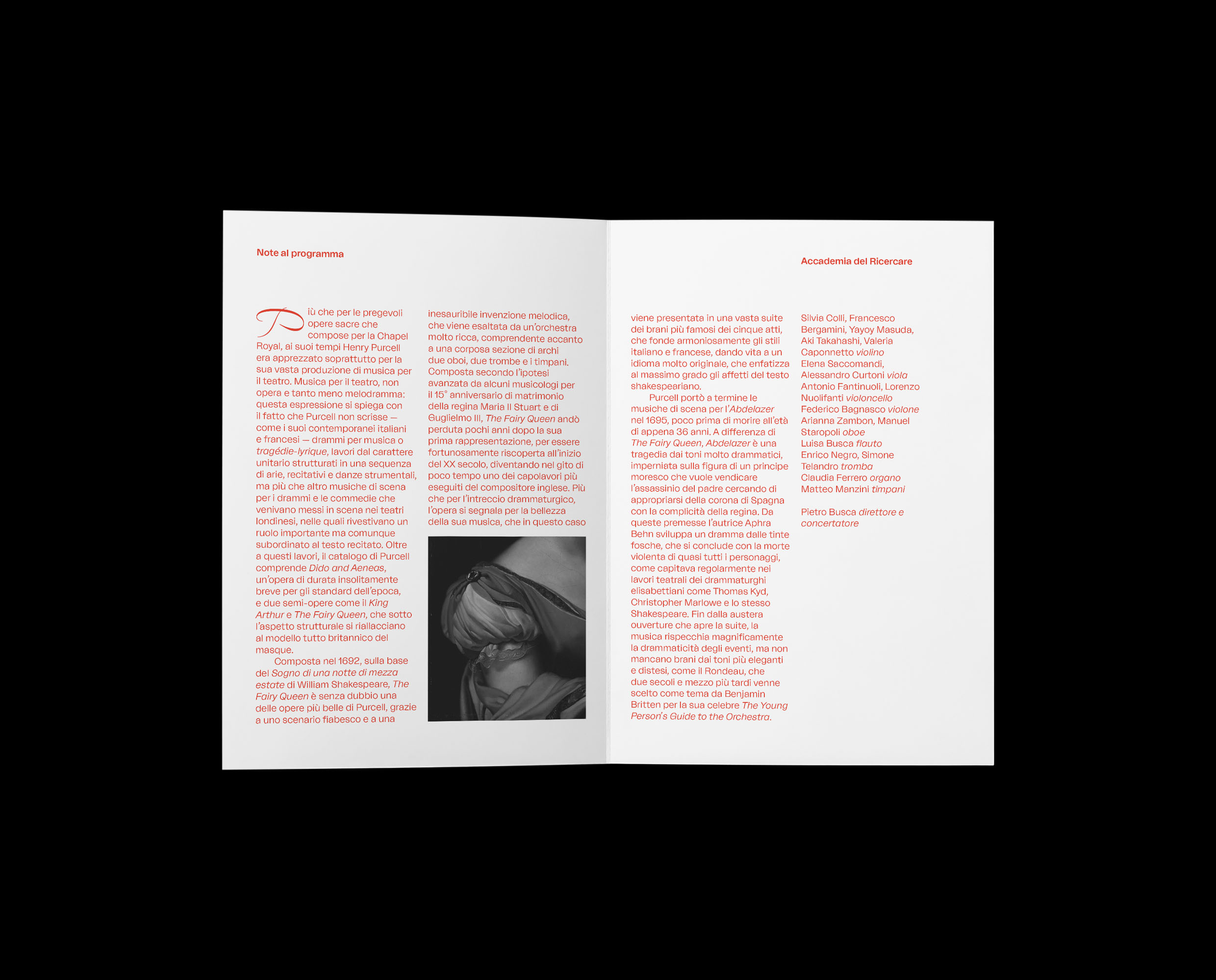
Carefully selected artworks turned to black and white were used to visually narrate the different themes of the concerts in the review


Antiqua 2021
Design the Metamorphosis
 branding
 editorial
 graphic design
- 2021
- with Koyaanisqatsi Collective
Concept
Antiqua is an annual classical music festival. We were asked to redefine the identity of the festival after the two-year pandemic. The visual identity reflects on the theme of transformation, which has become central over the past two years: only through continuous metamorphosis, a constant striving for the new, is it possible to resist the profound challenges the world imposes. Starting with an elementary basic form, which abstracts the original rose logo to the extreme, a constantly mutating visual identity was designed. From the initial form, we created graphic compositions of positive and negative shapes, defined by gray and red, the two colors of the 2021 edition.