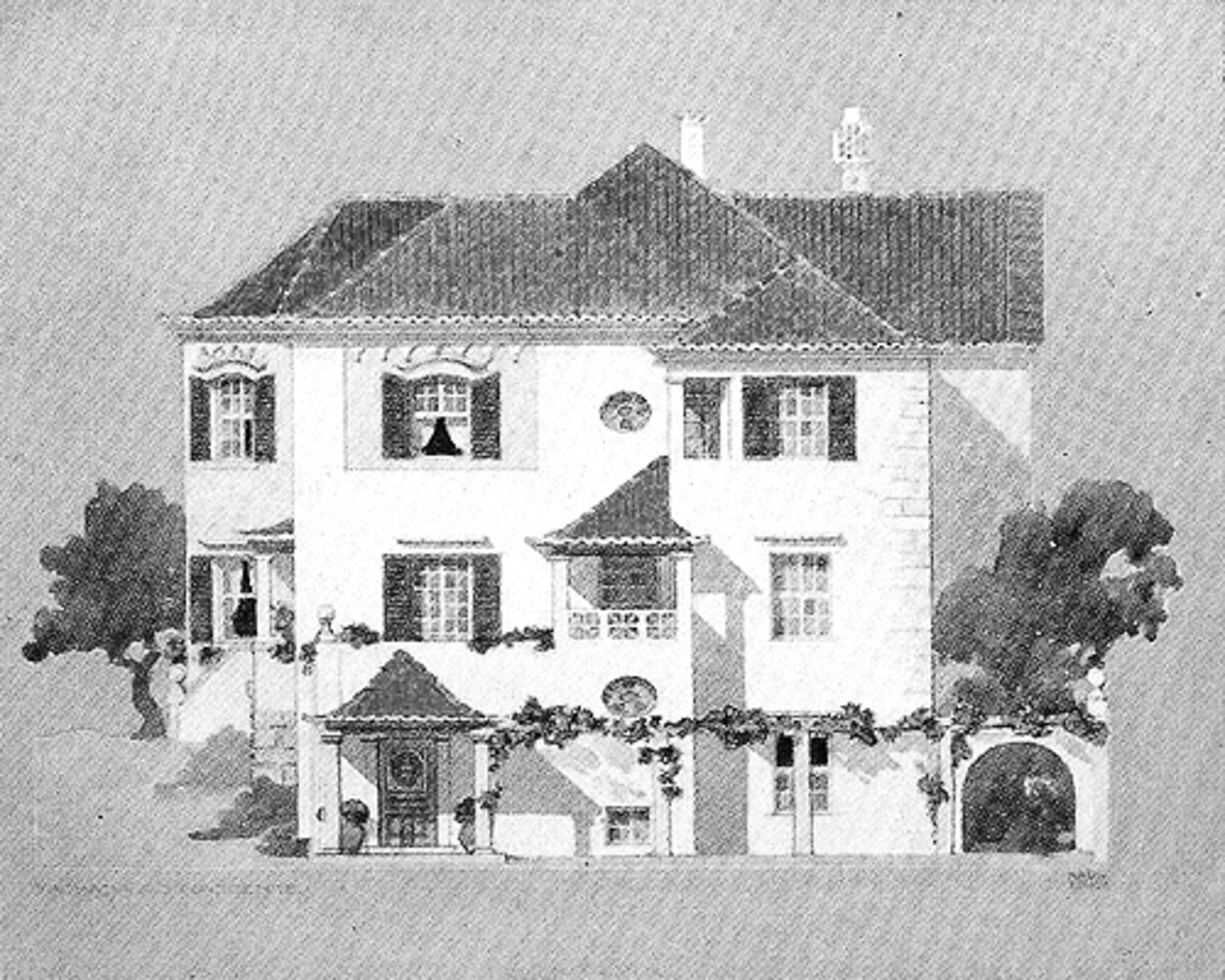
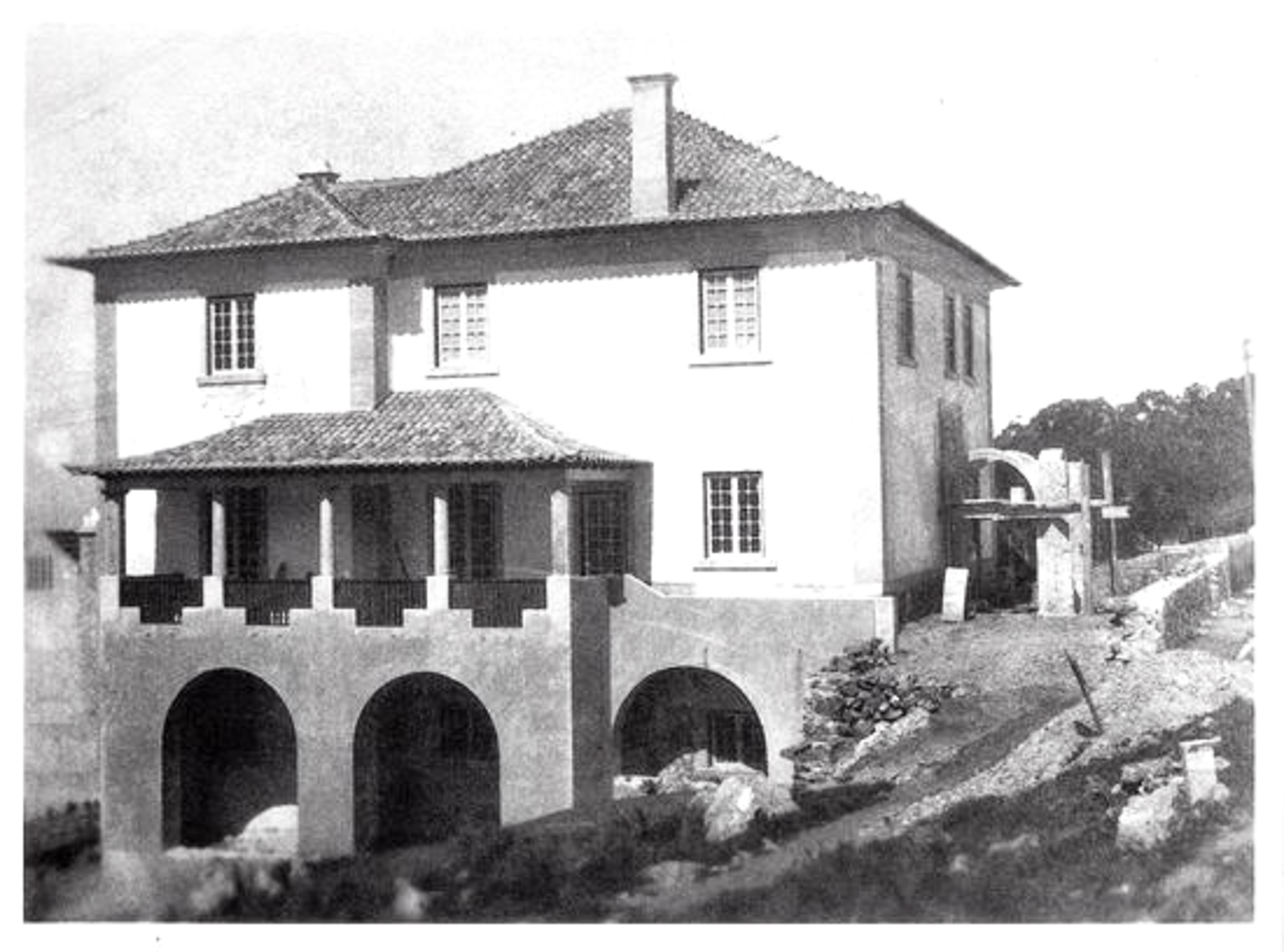
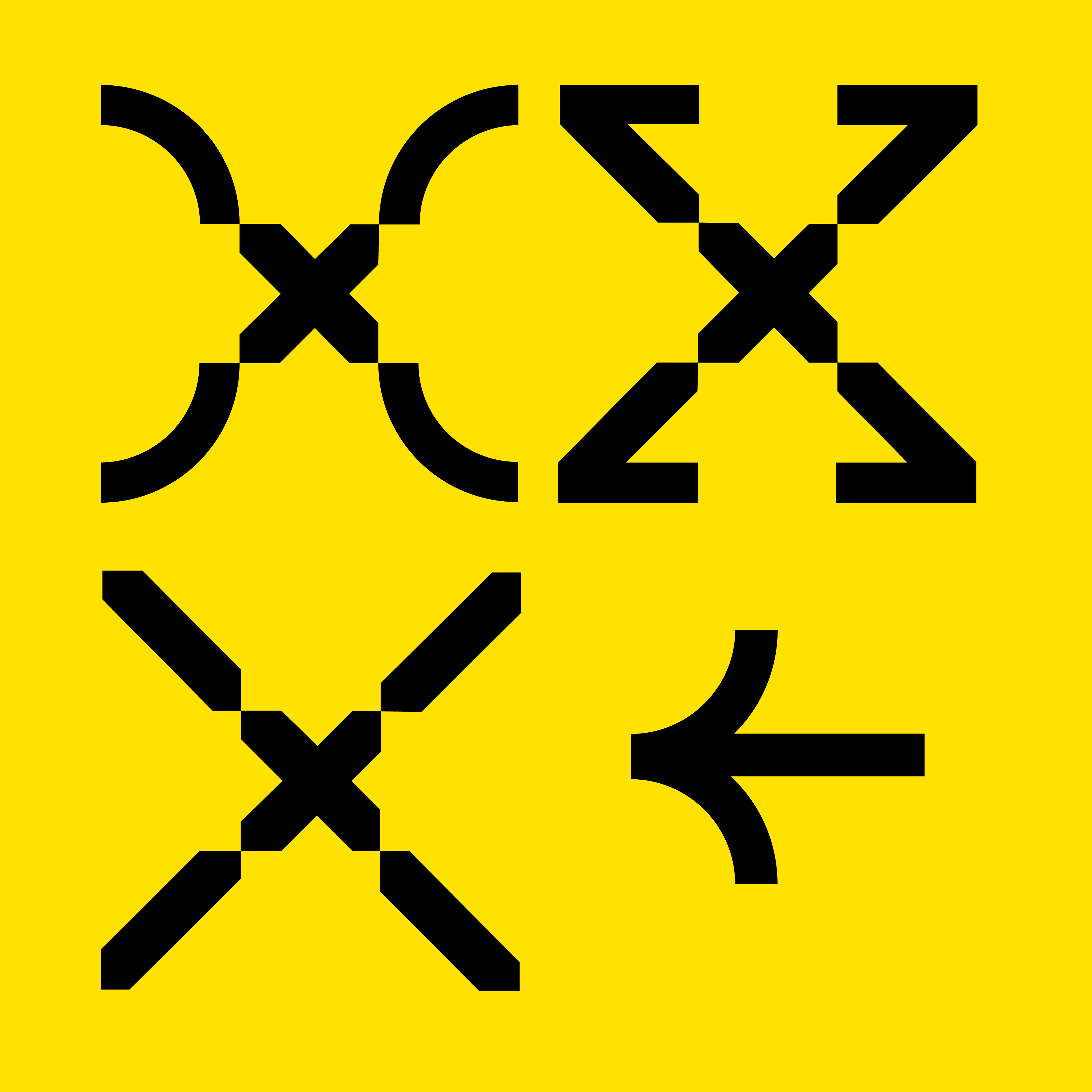
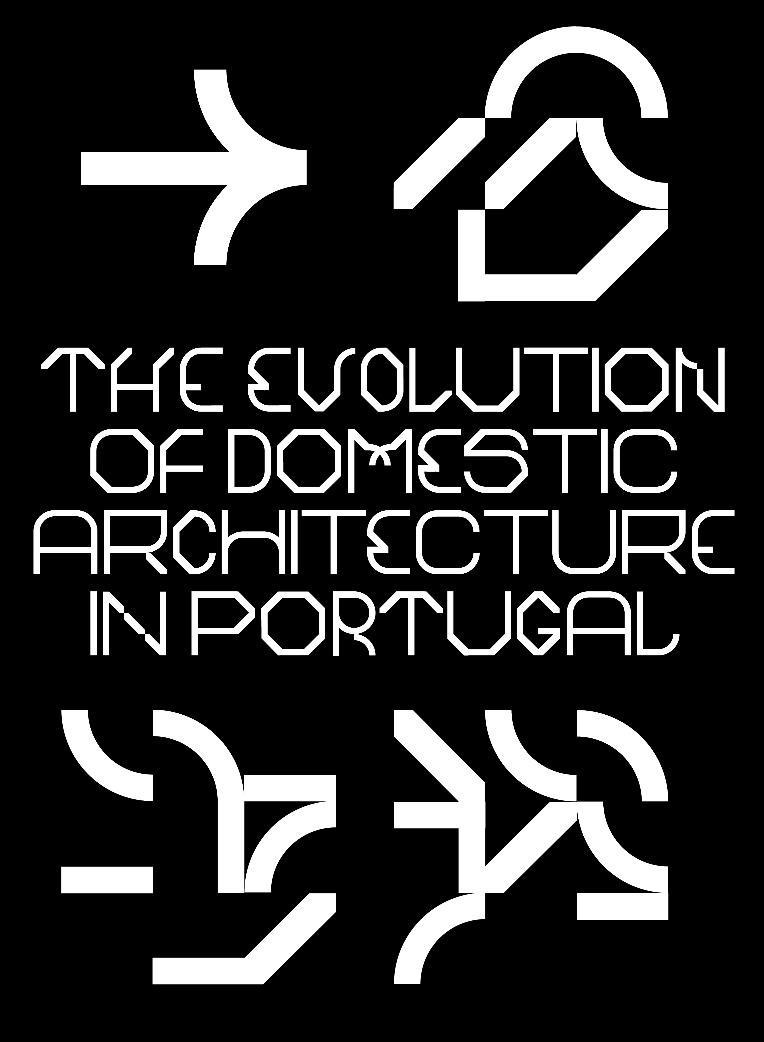
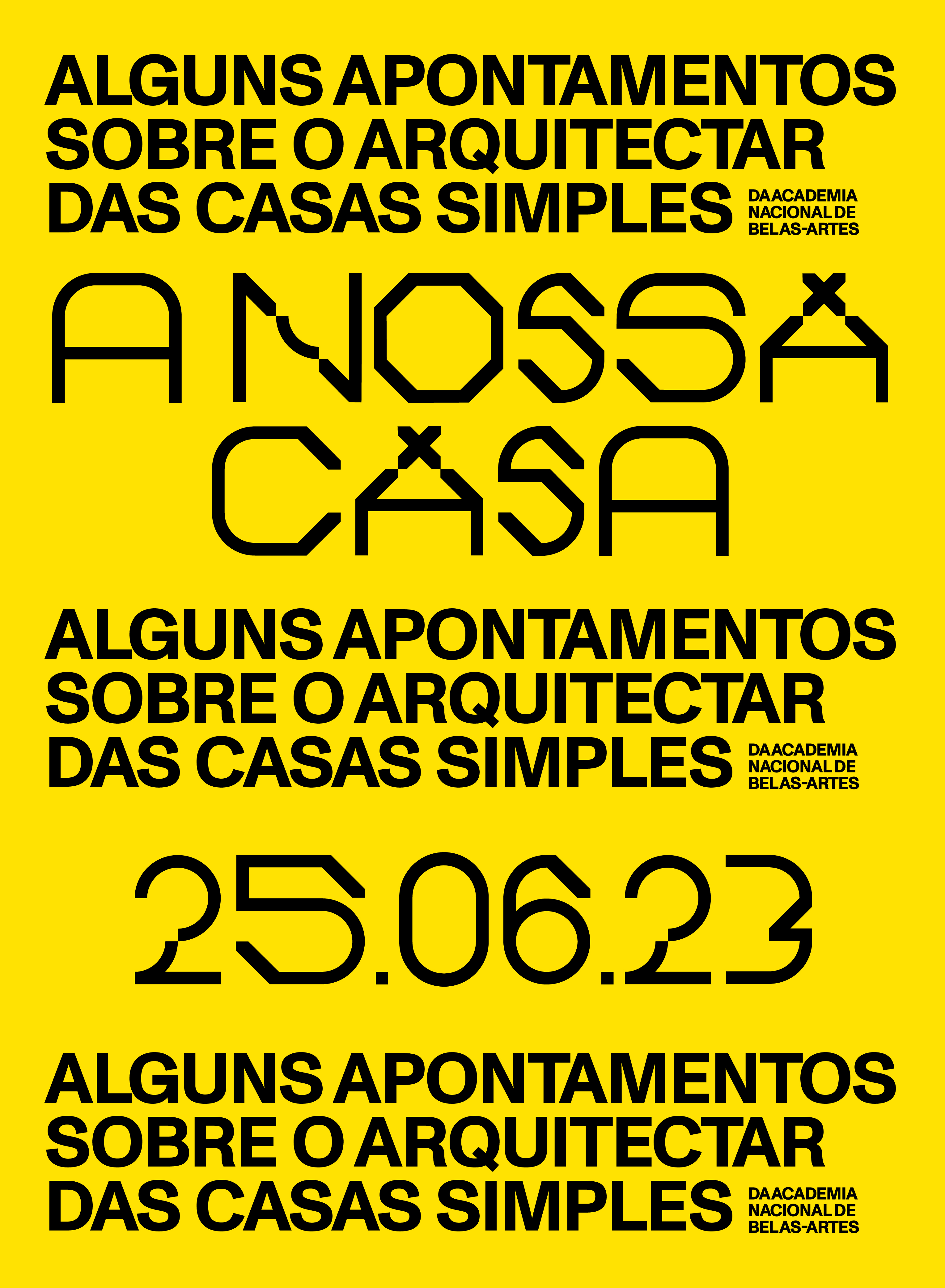
Raul Lino designed and built more than 700 projects. The architect defined and made famous the architectural canons of the typical Portuguese house, characterized by extreme compositional simplicity. The style of Raul lino's architecture, was summarized in three elementary forms, inspired in particular by the round arches, the roofs and the stereometric walls of his houses.
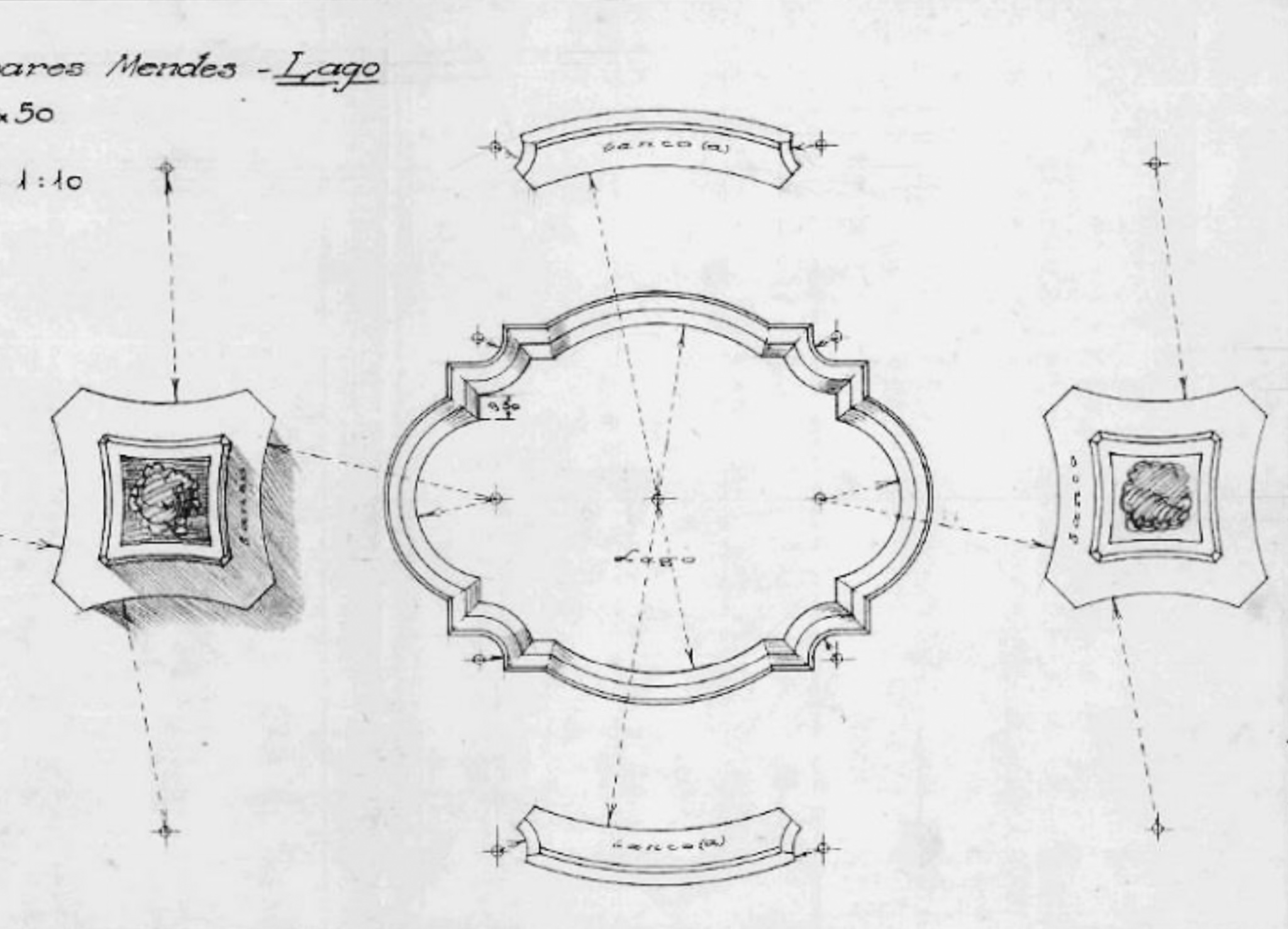
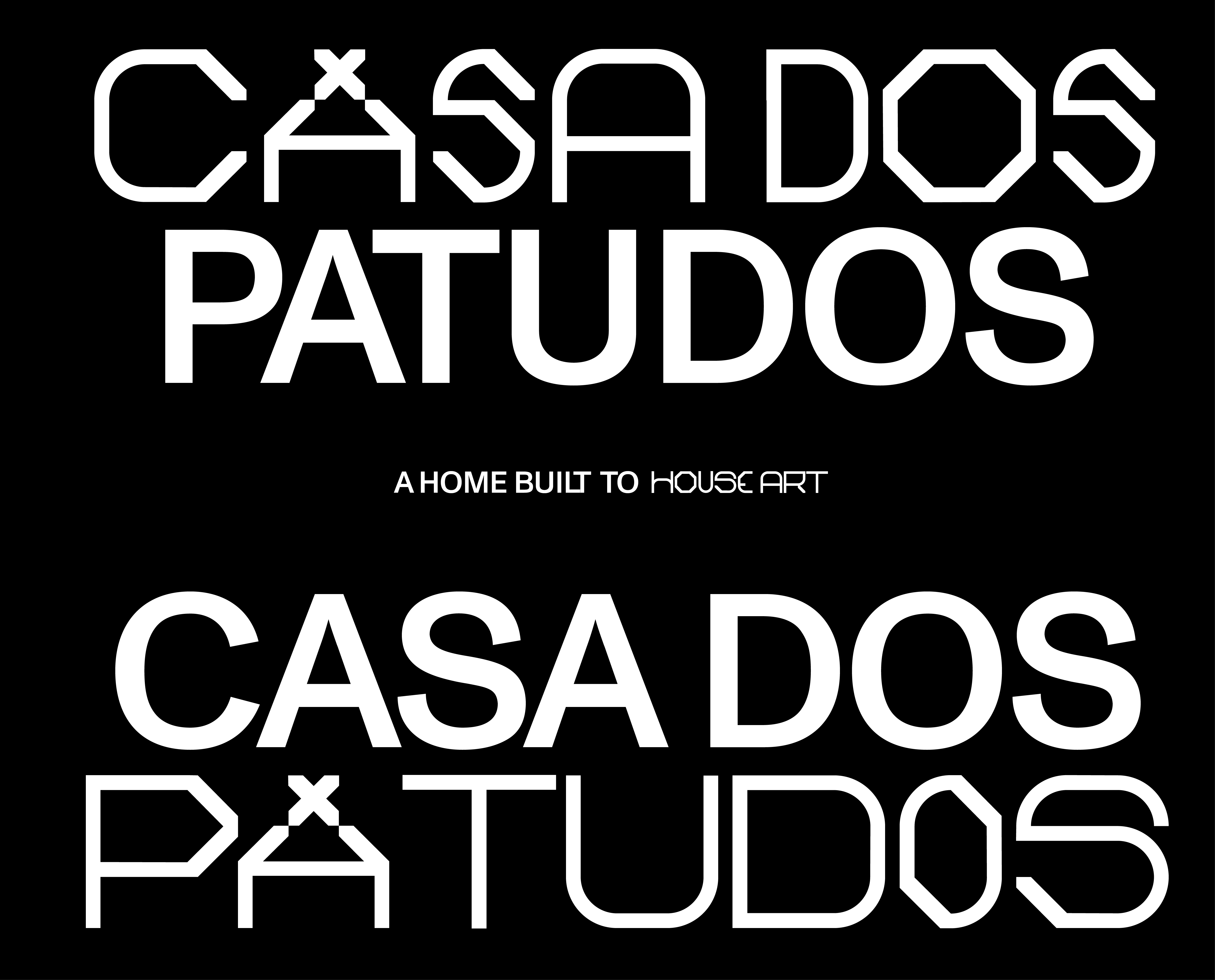
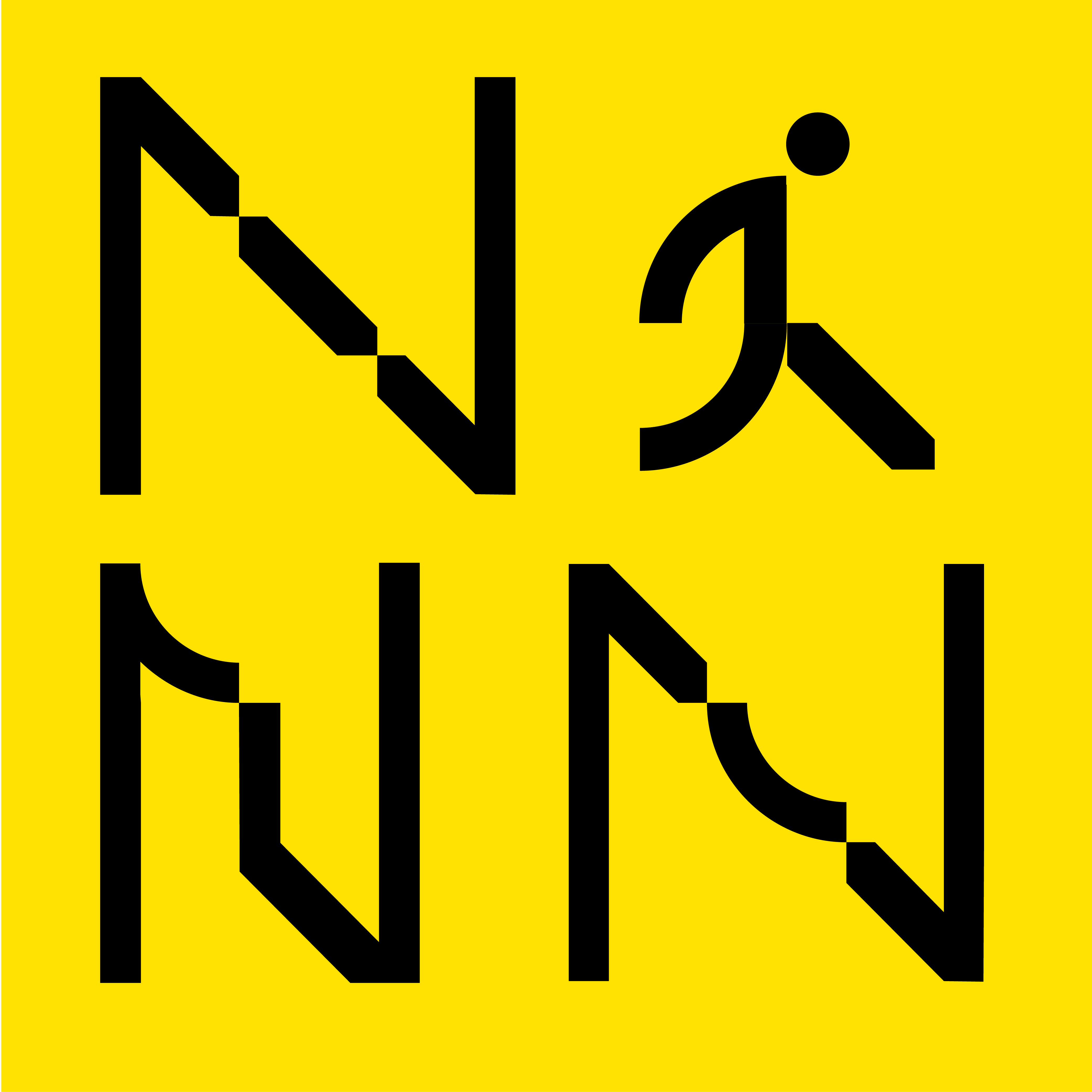
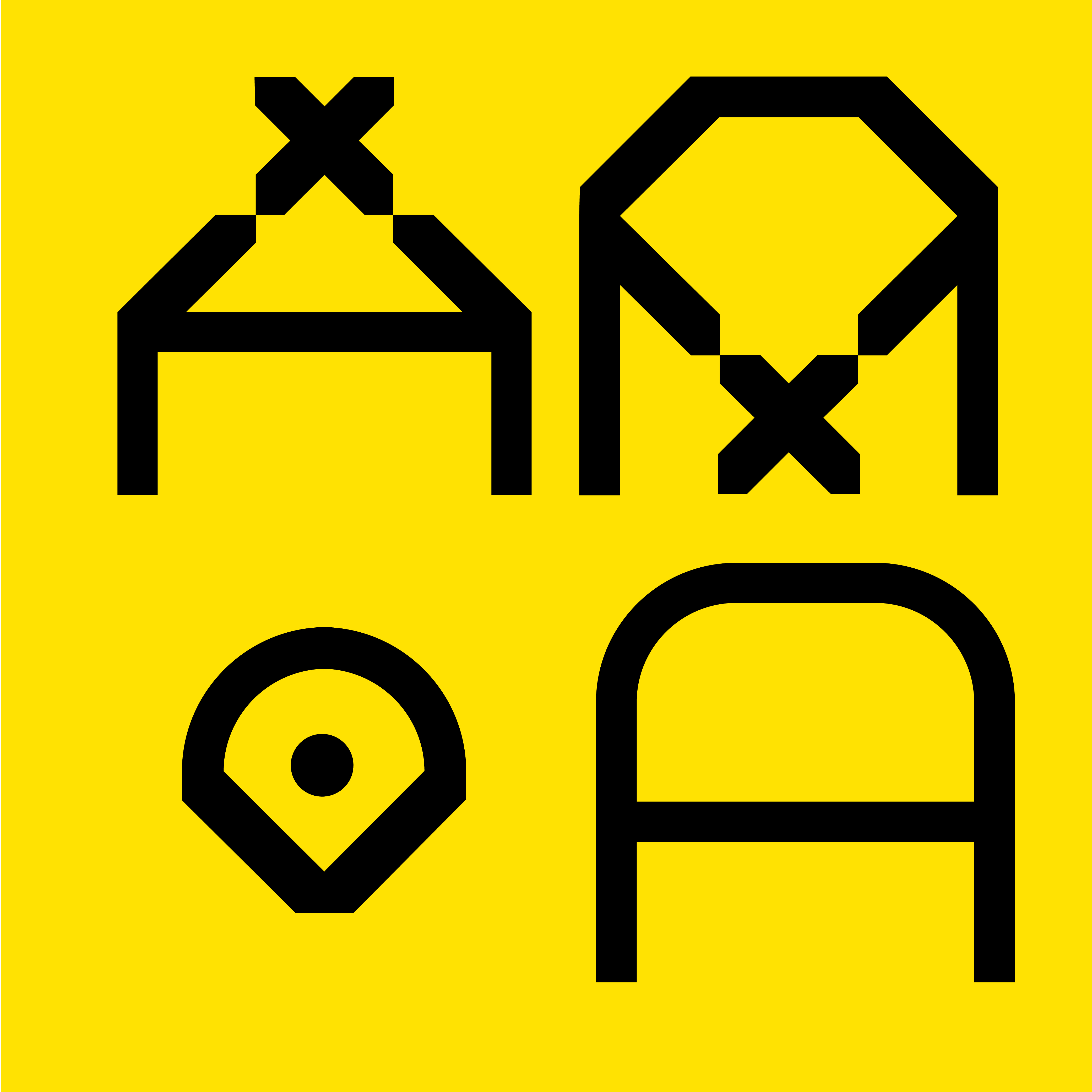
The three shapes are combined in a 3x3 grid, based on the typical squared shape of the Portuguese azulejos. The main custom typography is paired with the monument grotesk medium, both for headers and I text bodies.
Azul
Custom typo for Raul Lino
 typography
- branding
- 2020
- Politecnico de Tomar
Concept
We were asked to design the visual identity of the research center on Portuguese architect and designer Raul Lino.A modular custom and variable typeface has been designed. It's made by three shapes inspired by raul lino's architecture, composed in various ways in a 3x3 grid. The modular grid system allows to design a typeface, complete with icons and supporting symbols. For each letter, three variants were made that appear while typing according to a contextual cycle.